How To Create Tab Components with Invisible Borders in React
 Ogunuyo Ogheneruemu B
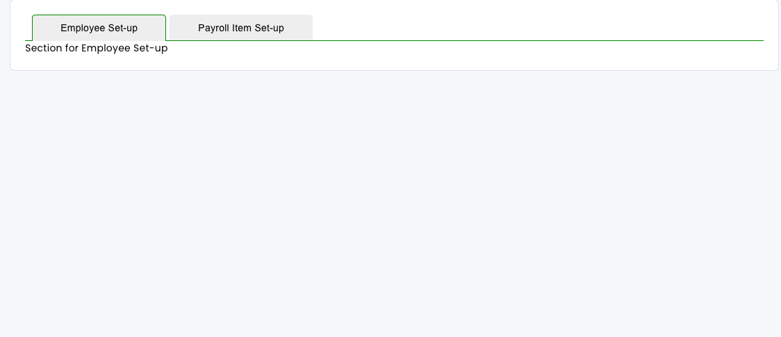
Tab navigation is a cornerstone of user-friendly interfaces, allowing seamless content organization. Leveraging CSS, we can elevate the visual appeal of tab components by ingeniously manipulating borders.
HTML Structure
Our starting point involves setting up the HTML structure for the tab component:
import React, { useState } from 'react';
import './tabstyle.css';

export default function Tab({ children, tab1Text, tab2Text }) {
    const [activeTab, setActiveTab] = useState('tab1');

    const handleTabClick = (tab) => {
      setActiveTab(tab);
    };
  return (
    <div className="tab-component">
        <div className='button-container'>
    <button
      className={activeTab === 'tab1' ? 'active tab-button' : 'tab-button'}
      onClick={() => handleTabClick('tab1')}
    >
       {tab1Text}
    </button>
    <button
      className={activeTab === 'tab2' ? 'active tab-button' : 'tab-button'}
      onClick={() => handleTabClick('tab2')}
    >
      {tab2Text}
    </button>
    </div>

    {/* Content for Tab 1 */}
    {activeTab === 'tab1' && (
      <div className="tab-content">
    {children[0]}
      </div>
    )}

    {/* Content for Tab 2 */}
    {activeTab === 'tab2' && (
      <div className="tab-content">
       {children[1]}
      </div>
    )}
  </div>
  )
}
Crafting Stylish Tabs
Let's delve into the CSS to style our tab buttons and container:
.button-container {
  border-bottom: 1px solid green;
  position: relative;
}


.tab-component .tab-button {
  padding: 10px 40px;
  background-color: #eee;
  border: none;
  cursor: pointer;
  outline: none;
  margin-right: 5px;
  border-radius: 5px 5px 0 0;
  position: relative;
  border: 1px solid transparent;
  border-bottom: none;
  position: relative;
  left: 10px;
}


.tab-component .tab-button.active {
  border-color: green;
}

.tab-component .tab-button.active::after {
  content: '';
  position: absolute;
  bottom: -1px;
  left: 0;
  width: 100%;
  height: 1px;
  background-color: #eee;
  z-index: 1;
}
Unveiling the Magic
The magic happens in the .tab-button.active class! By cleverly manipulating the border-bottom: none; we've made the active tab button appear seamlessly connected to the content, offering a sleek and uninterrupted visual flow.
Wrapping Up
The strategic removal of the bottom border for the active tab button yields a visually refined tab component. This CSS trick ensures a smooth transition between tabs, enhancing the overall user experience.
Feel free to experiment and adapt these styles to your project's design language, creating a polished and engaging interface for your users!
Subscribe to my newsletter
Read articles from Ogunuyo Ogheneruemu B directly inside your inbox. Subscribe to the newsletter, and don't miss out.
Written by

Ogunuyo Ogheneruemu B
Ogunuyo Ogheneruemu B
I'm Ogunuyo Ogheneruemu Brown, a senior software developer. I specialize in DApp apps, fintech solutions, nursing web apps, fitness platforms, and e-commerce systems. Throughout my career, I've delivered successful projects, showcasing strong technical skills and problem-solving abilities. I create secure and user-friendly fintech innovations. Outside work, I enjoy coding, swimming, and playing football. I'm an avid reader and fitness enthusiast. Music inspires me. I'm committed to continuous growth and creating impactful software solutions. Let's connect and collaborate to make a lasting impact in software development.